Wealth and inequality
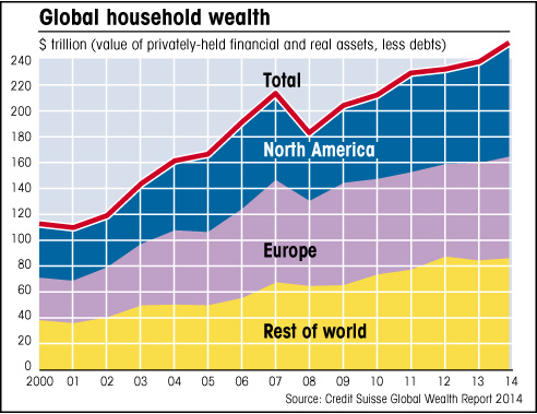
The above chart, using Credit Suisse data, shows how the world’s privately-held wealth has doubled this century. If one thinks about it, this is an astonishing fact, assuming these figures are correct. How is it possible that the same amount of wealth has been created in one decade as was accumulated in all of past history?
The short answer: it isn’t possible. Although the boom in China explains some of the rise, this increase in wealth is partly an illusion, linked to the related trends of rising credit (which leads to higher assets prices) and devalued money (especially the US dollar). I return to these themes in detail later in the book, but first we can still learn something useful from this chart, because although it might be misleading in some respects, in other ways it is accurate enough. For example, the chart shows how wealth is split roughly into thirds between North America, Europe and the rest of the world, which means of course that it’s very unevenly distributed, as we might expect. The US, with 4% of global population, has 30% of all wealth and over 40% of all individuals with $50-million or more.
What we find, in other words, is that wealth is highly concentrated amongst relatively few very rich people, and as I noted in the opening chapter, this inequality is increasing.
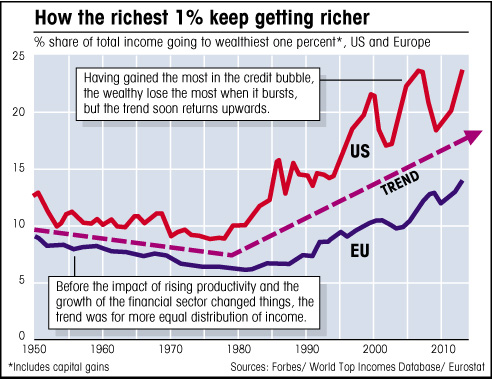
The above chart shows how the richest 1% have been grabbing ever more of the world’s wealth, leaving less for everyone else. The next chart shows the huge gains seen by the wealthiest 10% in Britain and the US, especially since 1980, compared to the rest of the population, whose incomes have actually fallen in recent years, to the point where most people are earning less, in real (inflation-adjusted) terms, than they did in the 1970s.
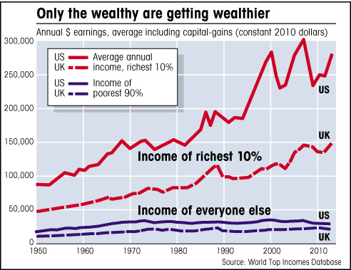
It isn’t possible to get such accurate data for most countries, but although the equivalent figures for Europe might show less of a gap between the rich and everyone else, because Europe generally has a more even spread of wealth, the trend in most of the developed world is for declining wages in real terms, as my next chart shows.
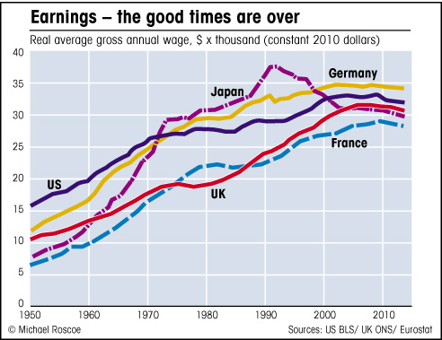
This trend for declining earnings for the majority, while the rich get richer, coincides with the decline in manufacturing jobs.
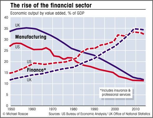
As the number of jobs in industry falls relative to output, the share of corporate profit that goes to owners and executives increases and the share that goes to the general population falls. Combine this with the rise of the financial sector, where a relatively small workforce – traders and fund managers and so on – earn large incomes (as seen below) and we get an idea why income inequality, and especially wealth inequality, is increasing.
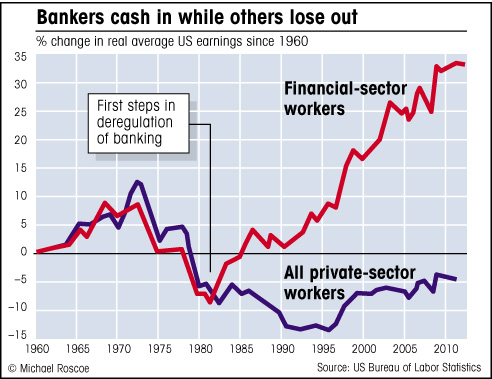
There are various ways of looking at the gap between the very wealthy and the rest of us, but they all show the same trend: the rich are getting richer while the middle classes of the developed world get poorer and everyone else – the really poor – struggle along on next to nothing, as they always have done. Something has gone seriously wrong with the idea that free-market capitalism is the best way to spread wealth.
Yet in the relatively recent past, over the last half-century or so, a vast amount of wealth has been made in this world, all of it originating in the earth before being turned into something useful by industrial workers. So what’s gone wrong with the system? How can so much of the earth’s wealth, most of which comes from natural resources that can’t really ‘belong’ to any one person – should surely belong equally to everyone – end up in the hands of so few?
I would suggest that the economic problems affecting most developed nations today are primarily a result of the decline in the primary and secondary sectors relative to their overall economies. Too much reliance has been put on the service sector for employment, and although during the boom years the service sector created millions of well-paid jobs, the wealth still had to be created originally by the primary and secondary sectors. We lost sight of this fact.
We came to believe that the financial services ‘industry’, for example, created wealth, when all banks really do is take wealth that’s already been created in the real economy, much of which is now held in large investment funds (ie, other people’s savings and pensions), and try to profit by lending that money, or by borrowing more money against it (leveraging) and speculating in things like derivatives, in the hope of making more money. But this whole business, which according to GDP figures adds around $5-trillion dollars a year to the global economy, doesn’t actually create a penny in real wealth. The nature of derivatives, which form the bulk of financial trading these days, is such that when one trader gains, someone else must lose, just as with the more obvious forms of gambling, only worse, because the loser might not be another gambler, but an innocent investor, or pretty much anyone (more on this in later chapters). Does the betting shop or the casino create wealth? Of course not.
So that $5-trillion wasn’t really new wealth at all, it was a combination of wealth that already existed and credit that had been artificially created by leverage. A lot of that existing wealth will have crossed international boundaries, so in that respect nations such as Britain and Switzerland gain, but from a global perspective financial services don’t create wealth. What they create is debt.

